ShopDreamUp AI ArtDreamUp
Deviation Actions
Daily Deviation
Daily Deviation
October 7, 2007
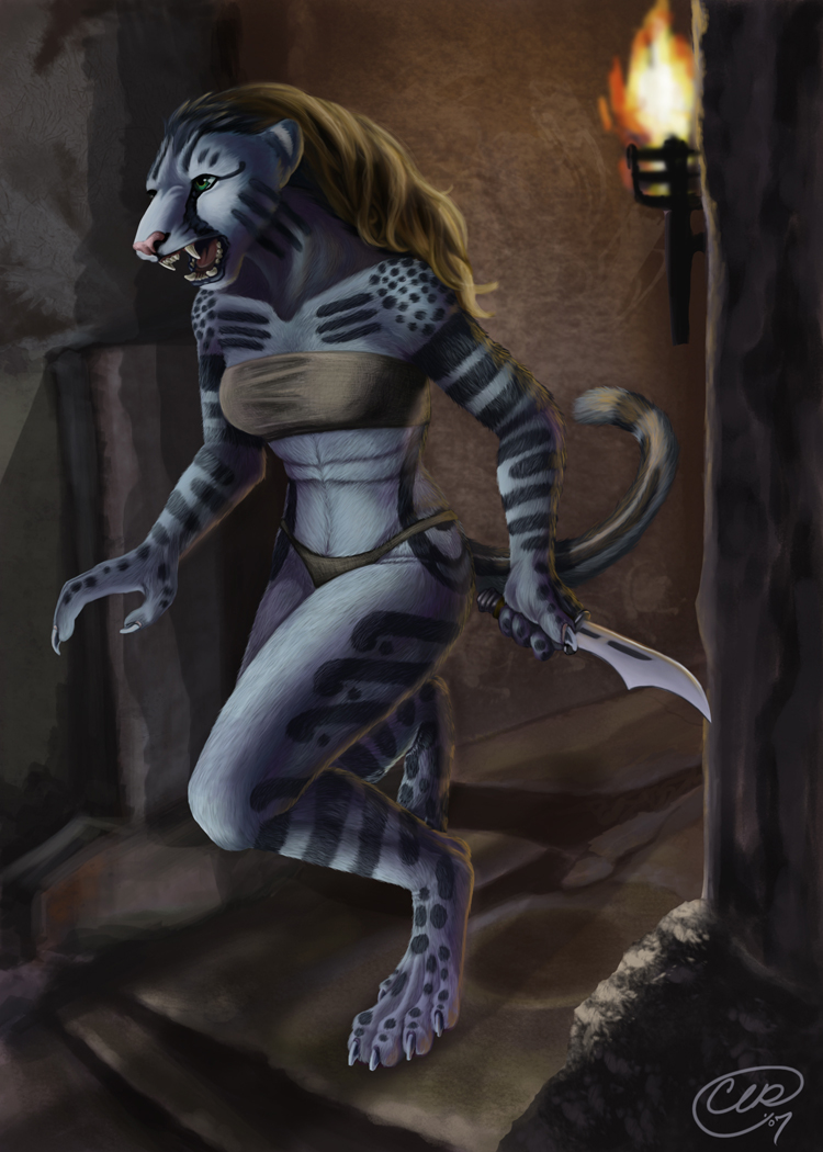
In the light of the night... by =charreed has superb lighting and a facial expression that says "don't mess with an anthro!"
Featured by cooley
Suggested by Negativefox
![[OPEN] Cheey V2 - RealisticStyle](https://images-wixmp-ed30a86b8c4ca887773594c2.wixmp.com/f/c7cfda43-3a8c-4ed5-bb9e-5b5a2890f319/dglzxq2-556ab748-213b-4d34-a1eb-011486c18e3a.png/v1/fit/w_375,h_750,q_70,strp/_open__cheey_v2___realisticstyle_by_blackonrog_dglzxq2-375w.jpg?token=eyJ0eXAiOiJKV1QiLCJhbGciOiJIUzI1NiJ9.eyJzdWIiOiJ1cm46YXBwOjdlMGQxODg5ODIyNjQzNzNhNWYwZDQxNWVhMGQyNmUwIiwiaXNzIjoidXJuOmFwcDo3ZTBkMTg4OTgyMjY0MzczYTVmMGQ0MTVlYTBkMjZlMCIsIm9iaiI6W1t7InBhdGgiOiJcL2ZcL2M3Y2ZkYTQzLTNhOGMtNGVkNS1iYjllLTViNWEyODkwZjMxOVwvZGdsenhxMi01NTZhYjc0OC0yMTNiLTRkMzQtYTFlYi0wMTE0ODZjMThlM2EucG5nIiwiaGVpZ2h0IjoiPD0yNTYwIiwid2lkdGgiOiI8PTEyODAifV1dLCJhdWQiOlsidXJuOnNlcnZpY2U6aW1hZ2Uud2F0ZXJtYXJrIl0sIndtayI6eyJwYXRoIjoiXC93bVwvYzdjZmRhNDMtM2E4Yy00ZWQ1LWJiOWUtNWI1YTI4OTBmMzE5XC9ibGFja29ucm9nLTQucG5nIiwib3BhY2l0eSI6OTUsInByb3BvcnRpb25zIjowLjQ1LCJncmF2aXR5IjoiY2VudGVyIn19.6SmvY1qsqWh3yOQSLuO67Pt4fncGVM8yJC7rryYucHo)


Description
Or... something like that. I would have been smart to write down a few of the titles I was thinking of while I was working on this piece. Probably one of the more in depth pieces I've managed to do in quite a long while. This took about a week and a half to complete. I didn't really want to show any work in progress because even though I really appreciate crits and critique, I wanted to really gauge my own level. I wanted to note where my skills lie in their own right and see where I stand. How do you know what to improve if you never know where you stand? I wanted a solid, completed piece for people to critique me on, because sometimes a WIP, the line seems to blur between what is the idea you want to convey and what idea others want you to convey- even though a good critic will concentrate on the facts of the piece, not necessarily the subject matter.
Well- here is my werecat, loosely based on my character as well as my character in Oblivion. That game really inspired this piece to come to life. I first worked in Open Canvas and soon got frustrated with the lack of sure power of the program. I believe I wanted to move the sketch over and couldn't figure out how to do so without rotating the whole canvas - which I found a useless capability. I dragged it over to Photoshop and turned it into quite the project. Originally just a line drawing, the linework I created in OC was not satisfactory. So I turned it into a lineless piece and I like it much better for it.
Seeing a smaller version makes me realise that the character is a bit bright and I could possibly push color contrast and just regular contrast more in the piece. The light from the front of the character is a bit bright. The piece does not overall have a lot of dark contrast. I guess I got a bit intimidated when all the darker colors I was choosing were near the lower left (black) corner, making me hesitant to choose it. I guess the lights are too light and the darks are a bit too dark. Aw well. Live and learn. I did learn a lot from this piece. Hope you enjoy.
Image size
750x1050px 417.01 KB
© 2007 - 2024 CharReed
Comments77
Join the community to add your comment. Already a deviant? Log In
She's adorable!